Proportion in photography is the perceived size relationship between elements in your frame, and you control it most directly with distance, focal length, and where you place size references. If you move closer or use a wider lens, foreground objects grow quickly and feel dominant; if you step back or use a longer lens, sizes compress, backgrounds loom larger, and the scene looks flatter. Add a person, sign, or familiar object to communicate scale; then choose or crop an aspect ratio that preserves those relationships when you export or print.
To get the effect you want, start by deciding whether you want natural or dramatic proportion, then set your working distance and lens accordingly. Close with a wide-angle for an exaggerated foreground; back up and use a short telephoto to keep faces and products looking true; and remember that your final aspect ratio may crop away scale cues near the edges. These three moves—distance, focal length, and size references—solve most proportion decisions in the field.
Proportion in Photography: The Quick Answer and How to Control It
Think of proportion as visual math: every change in camera position changes the ratios of big to small. The closer your camera is to one subject compared with another, the larger that subject appears. A wide lens doesn’t “distort” faces on its own—getting too close does. A telephoto doesn’t “flatten” space by magic—it encourages you to stand farther back, which reduces the size difference between foreground and background.
Fast controls you can apply today:
- Distance: Halve the distance to the foreground and it roughly doubles in frame area compared with the background. Use this to create foreground punch in landscapes or tame distortion in portraits by stepping back.
- Focal length: Wider lenses make near objects feel much bigger relative to far objects; longer lenses compress size differences and bring the background “closer.”
- Size reference: Include an object of known size (a person, car, doorway, dollar bill) to communicate scale instantly.
Field recipes (full-frame / APS-C / phone):
- Head-and-shoulders portraits: 70–105 mm FF (45–70 mm APS-C; 2–3x phone) at about 1.2–2.5 m for natural proportions.
- Environmental portraits: 35–50 mm FF (23–35 mm APS-C; 1x–2x phone) at roughly 1.2–2.0 m; watch the nose and edges.
- Landscape with foreground accent: 14–24 mm FF (10–16 mm APS-C; 0.5x phone) within 0.5–1 m of the foreground subject.
- Product/food: 85–135 mm FF (55–90 mm APS-C; 2–3x phone) at 0.7–1.5 m to keep shapes true.
- Architecture exteriors: 24–35 mm FF (16–23 mm APS-C; 0.5x–1x phone), stand farther back, keep camera level, and correct perspective later if needed.
Smartphone quick wins: prefer the 2x or 3x lens for people and products; step back and use optical zoom rather than pinching; enable grid and level tools; and use built-in perspective correction after the shot to keep verticals vertical.
Scale vs proportion vs aspect ratio (and why it matters)
Scale is the sense of absolute size the viewer infers from context; proportion is the relative size of elements inside your frame; aspect ratio is the shape of your frame. A person standing next to a lighthouse gives scale (we know roughly how tall a person is). Making that person small in the frame while the lighthouse fills the vertical height is a proportion choice. Cropping from 3:2 to 1:1 later changes the frame’s boundaries and can remove the person entirely, hurting both scale and proportion.
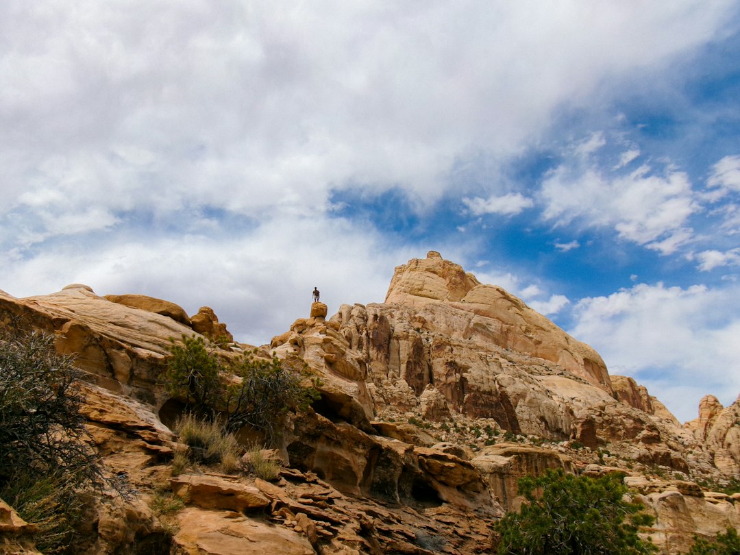
Proportion influences visual weight and balance. A small figure against a giant cliff makes the cliff feel overwhelming; a large foreground rock with a distant mountain makes the image feel grounded and three-dimensional. Aspect ratio quietly supports the story: a tall 4:5 portrait emphasizes vertical relationships; a wide 16:9 frame emphasizes lateral spacing and negative space.
Example breakouts:
- Same scene, two distances: Stand close with a 24 mm to make a flower dominate a valley. Stand back with a 105 mm to make the valley loom and the flower shrink. Same subjects, different proportion, different feeling.
- Scale cue added: Without a hiker, a canyon can read as small; add a hiker and the canyon becomes massive. You didn’t change the canyon—only the size reference.
- Aspect ratio shift: Crop a 3:2 landscape to 16:9 and the wide feel grows, but you may cut off a rock near the edge that anchored scale. Composition and proportion are partners with the frame shape.
How to control proportion in-camera: distance, focal length, and angle
Distance is the big lever. Imagine two lampposts: one 2 m away and one 20 m away. If you step forward 1 m, the near lamppost goes from 2 m to 1 m away—twice as big in your frame—while the far one goes from 20 m to 19 m—barely changed. That asymmetry is why wide-angle close-ups feel exaggerated. Keep this in mind when you approach faces, food, or small objects you want to look natural.
Focal length sets how much of the scene you include and nudges where you stand. Wide-angle lenses (14–35 mm FF) expand space and magnify near-far differences; telephotos (85–200 mm FF) compress size differences and keep shapes closer to how we remember them. Neither is right or wrong—the question is what feeling you want.
Camera height and angle matter too. Eye-level feels neutral; low angles make subjects feel dominant and taller; high angles make them feel smaller or more vulnerable. Keep the camera level for architecture to avoid leaning lines, or embrace a tilt for dramatic proportion if that suits your story. Add foreground elements to create layers; overlap shapes to signal depth; leave negative space to let important elements breathe.
For more on how vantage point shapes a scene, explore perspective fundamentals here: Harness the power of perspective.
Field recipes by genre (with working distances you can trust)
Portraits
- Headshot: 85–105 mm FF (55–70 mm APS-C; 2–3x phone). Distance 1.2–2.0 m. Keep the camera slightly above eye level for a flattering jawline. Watch edge distortion if you must go wider; step back first.
- Half-body: 50–85 mm FF (35–55 mm APS-C; 2x phone). Distance 1.5–2.5 m. Keep hands and feet similar distances from the camera to avoid “big hand” or “big knee.”
- Full-body: 35–70 mm FF (23–45 mm APS-C; 1x–2x phone). Distance 2.5–5 m. Keep camera about waist to chest height to maintain limb proportions and minimize foreshortening.
- Groups: 35–50 mm FF (23–35 mm APS-C; 1x–2x phone). Distance 3–6 m. Align faces along a shallow arc to keep proportional sizes similar across the frame.
Landscapes and cityscapes
- Foreground anchor: 14–24 mm FF (10–16 mm APS-C; 0.5x phone). Place a rock, flower, or curb 0.5–1 m from the lens to create a dramatic size jump versus the background.
- Background emphasis: 70–200 mm FF (45–135 mm APS-C; 3x phone). Step back and compress a mountain, moon, or skyline behind the subject.
- Human scale: Add a person in bright clothing to reveal scale in vast spaces. Place them on a third for pleasing proportion.
Product and food
- Focal length: 85–135 mm FF (55–90 mm APS-C; 2–3x phone) to keep shapes believable and labels undistorted.
- Distance and height: 0.7–1.5 m from the subject; keep the sensor plane roughly parallel to the product’s front face for true proportions.
- Size cues: Include a hand, utensil, coin, or packaging to help the viewer read physical size.
Architecture and interiors
- Keep verticals: Use 24–35 mm FF (16–23 mm APS-C; 0.5x–1x phone). Step back and keep the camera level; raise the lens, not the angle. Correct residual keystoning in post.
- Room scale: Include furniture or a person near a doorway to show ceiling height and volume.
- When available: Tilt-shift lenses let you keep true proportions in-camera; phones and software can approximate with vertical correction tools.
Want to keep subjects expressive while maintaining natural proportions? Pair these guidelines with empathetic direction: Unlock the personality of your subjects.
Creative proportion: from natural to intentionally distorted
Forced perspective turns proportion into a playful illusion. The recipe: pick a distant background subject (like a building or sun), place your small foreground subject very close to the lens, and align them so they appear to touch. Stop down (f/8–f/16 on larger sensors; f/2–f/4 on phones) and back up slightly until both read sharp enough. Direct the foreground subject’s hands or pose to complete the illusion. A few centimeters of camera movement can break the alignment, so refine position carefully.
Juxtaposition is a quieter route: a tiny figure walking along the rim of a massive crater communicates awe without trickery. Negative space also influences proportion—leaving more space around a small subject makes it feel even smaller, while crowding the frame with large forms can feel oppressive.
Use composition guides to place masses: the rule of thirds is a reliable default for balancing heavy and light shapes; the golden ratio spiral can lead the eye through a progression of sizes from small to large. If you want a deeper composition toolkit to pair with proportion, see Master the art of composition.
Proportion and aspect ratio when cropping and printing
Aspect ratio changes breathing room and the way size relationships read. A tall 4:5 crop puts more emphasis on height; a 16:9 crop emphasizes width, often making small horizontal elements feel even smaller. Because many popular print sizes don’t match common capture ratios, think about your final output early and leave margin for safe cropping.
Capture ratios and common prints don’t always align. A 3:2 photo fits 4×6 and 12×18 perfectly, but it will be cropped for 8×10. A 4:3 photo fits 12×9 or 16×12, but gets trimmed for 8×10 as well. Square images fit 8×8 or 12×12 without change. Widescreen 16:9 images often need custom prints or cropping. The practical tip is simple: compose a touch wider than feels perfect in-camera when you know you’ll order sizes that don’t match your capture ratio.
Protect scale cues near the edges. If a person on a ridge defines the sense of scale and sits close to the frame border, it may be cut off when you print 8×10 from a 3:2 original. Shift them inward before pressing the shutter or plan a matched print size later.
Fixing proportion in post without breaking realism
Start with lens profile corrections to remove optical stretching or vignetting that can mislead the eye. Next, apply perspective transforms sparingly: keep verticals vertical for architecture and straighten horizons. Limit horizontal squashing or stretching to subtle percentages so people and products still look believable.
Use warp or liquify tools lightly to nudge edge distortion on faces shot a bit too close, but avoid reshaping anatomy. If a scene feels off, try a crop first: reveal a size reference you clipped, or change the aspect ratio to restore balance among large and small shapes. On phones, built-in tools in Photos or Snapseed can fix keystone lines and rotate quickly without overprocessing.
Quick-reference tables and on-location checklist
| Focal length (full-frame) | Equivalent on APS-C/phones | Typical working distance (single person) | Proportion effect | Best uses | Watch-outs |
|---|---|---|---|---|---|
| 14–24 mm | 10–16 mm APS-C; 0.5x phone | 0.5–1.5 m | Expands space; foreground looks huge | Landscapes, interiors, dramatic foregrounds | Close faces look stretched; edges pull |
| 24–35 mm | 16–23 mm APS-C; 1x phone | 0.8–2.0 m | Moderate expansion; natural environment feel | Environmental portraits, street, architecture | Mind edge stretch, keep camera level |
| 35–50 mm | 23–35 mm APS-C; 1x–2x phone | 1.2–2.5 m | Near-human perspective | Candids, half-body portraits, general scenes | Step back if noses/hands feel large |
| 70–105 mm | 45–70 mm APS-C; 2–3x phone | 1.2–3.0 m | Gentle compression; flattering faces | Headshots, products, food | Backgrounds grow, watch for clutter |
| 135–200 mm | 90–135 mm APS-C; 3x phone | 2.0–5.0 m | Strong compression; background looms | Isolated portraits, landscapes with big moons | Shallow depth of field; camera shake |
| 300 mm+ | 200 mm+ APS-C; 5x+ phone (digital/optical varies) | 5.0 m+ | Very strong compression | Wildlife, distant layering | Heat haze; tripod or stabilization helps |
Aspect ratio to print size mapping
| Capture aspect ratio | Print sizes with no crop | Print sizes with minimal crop | Areas typically lost when cropping | Tip to protect composition |
|---|---|---|---|---|
| 3:2 (most DSLRs/mirrorless) | 4×6, 8×12, 12×18, 16×24, 20×30 | 5×7, 11×14, 8×10 (5:4) | Short edges; subjects near left/right get trimmed for 8×10 | Leave margin near sides if you plan 8×10/11×14 |
| 4:3 (many phones/MFT) | 8×6, 12×9, 16×12 | 8×10, 11×14 | Top/bottom for 8×10; slight sides for 11×14 | Keep scale cues away from top and bottom edges |
| 1:1 (square) | 8×8, 10×10, 12×12 | — | — | Center mass carefully; squares magnify imbalance |
| 16:9 (widescreen) | 16×9, 24×13.5 (custom/lab-dependent) | 12×8, 18×10 (approximate) | Top/bottom if printed to 3:2 or 4:3 paper | Compose wider; expect cropping at common lab sizes |
- Decide intent: natural proportions or exaggerated drama?
- Pick output first: social crop, print size, or screen format; set your camera’s aspect ratio preview if helpful.
- Choose focal length for spacing: wide to expand, tele to compress.
- Set working distance to protect faces, products, and key shapes.
- Add or position a size reference (person, sign, door, coin) where it helps the viewer read scale.
- Scan the edges: don’t place scale cues where a future crop may cut them.
- Check horizon and camera height; level for realism, tilt for intent.
- Do a tele vs wide test frame from the same spot to preview different proportions quickly.
- Leave a crop-safe margin if you plan to print non-matching sizes.
- Apply quick perspective correction in-camera or in your editing app before sharing.
Common mistakes and 30-second fixes
- Big-nose wide portraits: step back, switch to 2x/3x lens, reframe at chest height.
- Tiny subject with no scale cue: add a person or familiar object, or move closer.
- Over-compressed telephoto scene with flat feeling: switch to a wider lens and move closer to add foreground depth.
Proportion lives alongside light and timing. If you’re shooting at dusk or need long exposures while you test distances and lenses, these guides will help you keep quality high while you work: low-light field guide and long exposure field guide.
FAQ quick hits:
- What are the eight elements of photography, and where does proportion fit? Lists vary, but common elements include light, color, line, shape, form, texture, space, and value. Proportion interacts with space and balance to shape how those elements feel together.
- Is 16:9 or 4:3 better? Neither; 4:3 gives more vertical headroom, 16:9 is cinematic. Choose based on your subject and final display, and compose with safe margins for prints.
- How do focal length and distance affect proportion? Focal length changes framing and tends to change where you stand; distance changes near-far size relationships. Distance is the stronger lever.
- How do you avoid distortion in portraits? Keep 1.2–2.5 m working distance, use 70–105 mm FF (2–3x phone), and keep features equally distant from the camera.
- What’s an example of proportion? A small person on a cliff next to a huge sea stack makes the rock feel massive; move the person close to the camera and the person dominates instead.