Street art play changed how I look at a crosswalk. I used to see paint as decoration. Then I watched a kid stop at a yellow arrow, hop once, then twice, and grin like the street itself had invited them to play. That invitation is powerful. It can slow traffic, pull strangers into the same moment, and make the most ordinary corner feel like a small stage. I want to show you how I plan it, paint it, and photograph it so the energy lives on even when the rollers are clean and the cones are packed.
Why it matters now: attention, safety, and neighborhood joy
I keep a small notebook of street corners that behave like magnets. The best ones collect people without trying: the coffee line that spills into the curb lane, the skate kids who treat a bus stop like a launch pad, the morning market that leaves chalk footprints by noon. When we add playful cues to paint there, the street starts telling a different story. Cars read the cues and slow down. Seniors pause to watch. Parents loosen their grip for ten seconds so a child can jump a spiral. We are not installing a sculpture. We are writing a script that anyone can act in for free.
There is a second reason. Neighbors remember moments, not memos. A flyer about traffic calming vanishes. But a spiral that sends a toddler into delighted spins becomes the story people retell. If you believe, like I do, that lasting improvements need both data and affection, Street art play is one of the few tactics that collects both in the same afternoon: a camera roll full of smiles and a speed gun showing what changed.
That mix of joy and proof is why I care about the details. On good days the paint looks fresh months later, the layout still suggests motion without confusion, and the photos explain the experience to someone who has never stepped on it. On tough days the colors bleach early, the stencil slips on a slope, and my images flatten the energy into shapes. The difference is rarely a giant budget. It’s a checklist you actually used, a schedule that respects nearby businesses, and a camera that looks for life instead of lines.
Street art play, done right: a field-tested checklist
Here is the checklist I run before any roller touches asphalt. It keeps a project from drifting into pretty-but-pointless and keeps me honest when the schedule gets tight.
- Intent: what behavior should the paint invite? Slower walking, playful detours, kids leading the way, drivers easing off the pedal.
- Audience and access: who will actually use it at 8 a.m., noon, and 8 p.m.? Wheelchairs, strollers, bikes, skateboards.
- Surface review: asphalt vs. concrete, crack density, oil stains, slope, drainage, existing striping, ADA bumps.
- Weather window: overnight low above 50°F, no rain for 24 hours, relative humidity under 80 percent, wind manageable for stencils.
- Paint and prep: traffic-rated coatings, compatible primer, silica or glass bead additive for grip, colorfast pigments.
- Layout safety: no conflicting cues with regulatory markings, clear buffer from stop bars, maintained crosswalk legibility, no illusions that could mislead drivers.
- Play grammar: repeatable patterns, clear entry points, visible prompts at child eye level, room for multiple bodies at once.
- Permits and neighbors: notice and listening session, a written access plan on paint day, a named contact if someone needs to get through.
- Roles and tools: one layout lead, one materials lead, two circulation stewards, hydration, shade, first-aid, cones, tape, brooms, blowers.
- Photo plan: who will document prep, painting, first use, intergenerational interactions, and late-day wear.
If you want a broader playbook on neighborhood activation, the neighborhood play guide on Arthavens helps with community tactics and messaging: https://arthavens.com/index.php/2026/09/15/street-art-play-guide/.
Pick the right spot: walkability, visibility, slope, and runoff
Every promising site tells its own story if you walk it at three times: morning commute, school let-out, and dusk. Patterns reveal themselves. The coffee line pushes people against a curb that floods after rain. A delivery truck idles where you hoped for a circle. A utility cut hides under gravel your rollers will hate. I carry chalk to sketch a test arrow and watch whether a ten-year-old notices it without being told. If they do, the site is promising.
What I look for, in order of importance:
- Natural foot traffic. If we must drag people to the paint, the play will feel like a pop-up, not a habit.
- Eyes on the street. Homes, storefronts, and bus stops provide passive stewardship. Blind corners encourage neglect.
- Clear sight lines for drivers. If the play field is near a crosswalk, an approaching driver should see regulatory markings first and only meet the artwork as a secondary layer.
- Drainage and slope. Water shortens the life of paint. A gentle crown is fine; a gutter that carries sand will sandpaper colors in weeks.
- Sun exposure. South-facing asphalt bakes pigment faster. Place the most saturated color where shade offers a longer life if you have the choice.
I mark utility lids, cracks, and paint ghosts (old striping that telegraphs through) on tracing paper taped to an aerial photo. That map guides the layout and the future maintenance pass. It also keeps me from inventing a perfect design that ignores the street’s memory.
Materials and color strategy that stand up to feet, bikes, and weather
I have tried cheap exterior paint on a friendly cul-de-sac. It looked great for one weekend and dulled to chalk the next. On a public corner, the materials have to earn the attention we ask for. My current baseline is a traffic-rated acrylic or waterborne coating the city already uses for crosswalks. If you can align with the municipal spec, you inherit their durability testing and maintenance teams know how to work with it.
My practical stack:
- Surface prep: pressure wash or scrub with a biodegradable degreaser, then rinse. Let dry fully. Blow debris just before priming.
- Primer: substrate-specific and thin. On old asphalt with oxidized binder, a bonding primer reduces dusting and strengthens color.
- Color coats: two thin coats beat one thick coat for curing and color hold. Tint in the can, not on the ground, for consistency.
- Non-slip: mix silica, pumice, or glass beads into the topcoat per manufacturer guidance. Test a small patch for grip with sneakers, sandals, and a wheelchair caster.
- Edges and stencils: 3–6 mil Mylar with painter’s tape, or heavy craft paper for quick curves. On windy days, weights matter more than clever shapes.
- Tools: 3/8 inch nap rollers for smooth concrete, 1/2 inch for coarse asphalt; angled brushes for edges; long handles to spare backs.
Color strategy matters as much as chemistry. High-chroma hues thrill kids but can tire adults. To keep harmony, I pick one hero color, two supporting colors, and one neutral to quiet the palette. Color temperature can subtly direct flow; warm tones pull people into a path, cool tones slow them at the edges. In bright sun, add a touch more contrast than you think you need; the sky washes delicate values. If your city uses a specific white or yellow for crosswalks, respect those hues so your artwork reads as companion, not competitor.
Patterns that invite play and respect movement
Lines alone do not make play. You need patterns that teach themselves in one glance. I test designs with three questions: can a six-year-old understand the first move without reading text, can two people use it at once without bumping, and is the last move open-ended so a kid can invent their own ending.
Patterns that work for me:
- Spirals with numbers near the center and icons near the rim. Newcomers can count inward; veterans invent silly rules for the icons.
- Double-dutch arcs that overlap, inviting two kids to mirror steps as if ropes were swinging.
- Footprints sized for both kids and adults, set at alternating rotations. A few facing each other spark improvised dances.
- Social mazes: two paths start at different corners and weave toward a shared middle. People see each other coming and offer a hand.
- Color bridges that cross a crosswalk leg. The stripes remain legible, but a path of dots shows where playful detours are welcome.
Designs that fail tend to over-instruct. Paragraphs on the ground kill spontaneity. Symbols beat sentences. Simple beats clever. Restraint also pays off in maintenance; a clean shape with one chip is easier to patch than a dense tapestry where a missing piece looks like a flaw.
Accessibility is part of pattern ethics. Keep graphic elements a respectful distance from tactile paving and curb cuts. Avoid high-contrast illusions that could confuse depth perception. If a pattern might draw a child into a driveway, move it or add a buffer. When in doubt, I ask a mobility advocate to walk the plan with me. Their notes have saved me from many near-misses.
Permits, neighbors, and safety you can stand behind
I learned the hard way that a polite notice posted in a café is not outreach. The best neighbors still resent surprise. I walk the doors, explain what will happen, and listen. That listening shapes both the design and the schedule. A bakery asked me to avoid 6 a.m. deliveries; we shifted the stencil work to mid-morning. A wheelchair user pointed out that one of my cue clusters might draw kids into the curb cut; we moved it back three feet and added a buffer stripe.
On the permit side, speaking the city’s language helps. Avoid jargon from our world. Say you are applying a high-visibility traffic coating with non-slip aggregate and that all regulatory markings will remain legible. Specify that a trained safety lead will keep cones and lookouts in place. On the plan sheet, show where you stop painting relative to stop bars and driveways. The clarity turns a skeptical reviewer into a partner rather than a blocker.
Day-of safety culture is non-negotiable. My roles list always includes two circulation stewards with reflective vests who do nothing but watch edges, talk with drivers, and keep kids inside the safe zone. When a delivery truck arrives early, they escort it through while the paint crew pauses, not the other way around. Everyone on the crew knows the stop signal and the regroup point. When people see us take safety seriously, they take the play seriously too.
Paint day playbook: roles, timing, and micro-routines
Paint day feels like a festival and a worksite at once. Without a rhythm, it frays fast. I run it as a sequence of micro-routines.
- Arrival hour: cones, canopies, hydration, and gear table first. Then a 10-minute all-hands brief: today’s layout, safety rules, who to ask for what, and where bathrooms are.
- Surface prep: sweep, scrub, rinse, blow. Only after the surface passes a white-towel test do we unroll stencils or chalk.
- Layout: chalk the big geometry first, then place the teaching elements (arrows, footprints, icons) within it. Snap photos now; this is your reference if a gust moves a stencil.
- Prime and first coat: assign two people to quality control. They check edges, drips, and coverage. Thin coats cure faster and hold color better.
- Non-slip broadcast: while the topcoat is tacky, a separate team broadcasts silica or beads in a controlled, even pattern. Test with a sneaker before you declare victory.
- Buffer and cure: plan a small chalk play zone on the sidewalk to keep kids engaged while paint cures. It reduces the temptation to step in early.
- First-use moment: when cones open, invite the kid who asked the most questions to take the first hop. Adults follow. That first ten minutes is when you capture the purest faces.
I keep a fallback plan for weather. If drizzle threatens the second coat, we seal the most damage-prone edges and schedule a quiet return in 48 hours to fill the middle. Perfection can wait. Keeping the promise to neighbors matters more.
Photograph the life around the paint: setups, shots, and ethics
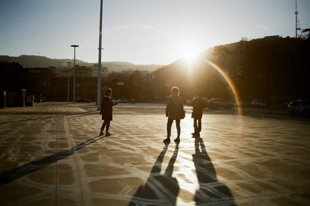
The goal is not a flat overhead diagram. The goal is proof of life. I shoot the work like a tiny theater: entrances, exits, close-ups of feet, mid-shots of pairs in sync, and wide frames that show context. If you want to sharpen your eye for timing and framing, this street photography primer on Arthavens is a solid companion: guide to capturing raw urban moments. Pair it with this lighting techniques article when you plan your golden-hour and overcast strategies: lighting techniques for stunning photography.
My practical camera notes:
- Arrive early for clean surfaces. Shoot a few frames of chalk lines and primer. These establish the arc of the day.
- Lens choice: a 24–35 mm equivalent for context, a 50–85 mm for expressions. Avoid ultra-wide unless you need drama; it can distort kids at the edges.
- Shutter priority around 1/500 sec for jumps and spins. Bump ISO without fear; motion blur hurts more than grain here.
- Focus on feet and hands when motion tells the story. Faces can come as they exit the pattern.
- Height: drop to kid level. Adults make play look smaller than it is. At knee height, the geometry suddenly feels grand.
- Micro-stories: a parent reading an arrow to a toddler, a teen guiding a grandparent across footprints, a driver watching with a half-smile.
- Consent and care: speak with guardians when focusing on one child. Shoot backs, silhouettes, and hands-on-paint to respect privacy while telling the truth of the day.
Don’t stop after golden hour. Night changes the paint. Reflections from headlights turn dots into constellations. If you want to practice handling dimmer conditions, this practical guide helps: low light photography field guide. A single storefront light can create a small stage; use it to make the geometry glow.
Night, rain, and wear: designing for hard conditions
Play shouldn’t clock out at sunset. I think about night during design, not after. Reflective bead in the last coat adds sparkle without turning the piece into a traffic device. Choosing colors with distinct luminance values (not just hue) keeps the pattern readable under sodium lamps or cool LEDs. I also place a few pale guide dots near entry points so a child senses where to begin even if the field feels dim.
Rain is less enemy than critic. It shows where the pattern holds and where it muddles. Tight detail washes into anonymity under a sheet of water. Broad geometry with strong edges keeps personality in puddles. For the first big storm, I always visit to watch how runoff travels. If water undercuts a heroic line, I adjust the maintenance plan to re-edge that zone more frequently.
Wear communicates. Shoes and bike tires darken high-touch spots. That tells you where the play truly happens. I accept patina as a compliment up to a point. When contrast drops below immediate legibility, schedule a refresh. The change I resist is accidental erasure: one missing arrow in a chain can become a safety issue if it confuses movement. Keep small jars of the hero and support colors labeled for quick, surgical touch-ups.
Keep it alive: maintenance, refresh cycles, and impact metrics
Street art lives among friction. Sun, rubber, salt, scooters, chalk, spilled coffee. Planning for refresh is part of the promise to your neighbors. I write a simple plan that fits on one page and post a copy behind the counter of the nearest shop that said yes on day one.
The plan includes:
- Light cleaning: monthly broom and gentle scrub with water to remove grit that accelerates wear.
- Quarterly inspection: edge clarity, grip texture, crack expansion, color fade check against the original swatch card.
- Touch-up windows: two evenings per season marked as potential quick fixes with cones and a tiny crew. Message the block the morning of.
- Full refresh cadence: every 12–18 months, earlier in high-UV zones if colors sink faster.
- Documentation: a shared album with before/after pairs from the same vantage points, and a short note on what changed and why.
Metrics keep the story credible. I measure vehicle speeds the week before and two weeks after, at the same hour on the same day. I count play interactions in a 30-minute window at lunch and at dusk. I gather short quotes from passersby and shop owners. None of this is scientific in the academic sense, but patterns emerge. When you present the next project, these numbers plus photos of real people become stronger than any deck. If you want to stretch your composition eye for documentation shots, this perspective piece is helpful: perspective for visual storytelling.
Budgets, resources, and a sample five-week timeline
There is a myth that you need a grant for everything. You need a plan, then you need partners. I draw a budget in three columns: things we will buy, things we can borrow, and things people can sponsor. The sponsor line is human-sized: one café buys brushes and snacks; a hardware store loans a blower; a neighbor with a garage keeps stencil sheets between projects. People like to say yes when the ask is precise.
Typical costs for one intersection corner (prices vary by city):
- Traffic-rated coating and primer: a few gallons for 300–400 square feet, plus non-slip additive.
- Stencils: durable Mylar sheets and scrap plywood weights. Re-usable if stored flat and dry.
- Tools: rollers, trays, extension poles, angled brushes, buckets, brooms, tape, chalk, gloves, vests.
- Site gear: cones, caution tape, canopies, folding tables, coolers, first-aid, trash bags.
- Documentation: spare SD cards, batteries, and a simple shot list printed for volunteers.
I budget time as carefully as paint. A ten-minute safety brief saves an hour of confusion. A midday volunteer swap keeps energy up. A planned snack break at 2 p.m. prevents the sluggish, messy hour when people try to push through hunger. None of this is glamorous, but these small choices are why linework still looks crisp when the sun drops.
To keep momentum and avoid endless back-and-forth, I use a simple timeline template. Adjust as your city or season demands.
- Week 1: site walks at three times of day, chalk tests, initial neighbor conversations, utility markings review.
- Week 2: draft layout on tracing paper over an aerial, two alternate patterns, color study swatches, meet-with-neighbors walk and listen session.
- Week 3: permit application or memo to the city with plan sheet and safety notes, materials order placed with backups, photo plan drafted.
- Week 4: stencil fabrication, recruit volunteers with named roles, confirm weather window, notify the block with a one-page plan.
- Week 5: paint day, doc team in place, first-use ritual. Create a shared album that night to keep momentum and schedule a quick touch-up window.
This timeline is not a cage. It’s a friendly metronome. If a storm pushes you back, slide one week and let the air out of your shoulders. The work exists to serve neighbors, not a calendar.
Case notes, pitfalls to avoid, and what lasts
Every error I list here comes from my notebook. I made them so you don’t have to. Side by side, I’ll share what worked at three corners that still look good on my walks.
Pitfalls to avoid:
- Over-designed layouts that need instructions. If a child hesitates, the pattern is overcooked. Reduce elements until the first move is obvious.
- Ignoring curb cuts and tactile paving. Keep play a respectful distance from accessibility cues. When in doubt, buffer more.
- Skimping on non-slip. Shoes vary. Wheelchair casters and scooter wheels find slick spots fast. Err on the side of grip.
- Color choices that look great in a shade mockup but vanish in full sun. Test swatches in the actual light.
- No plan for drivers. Cones alone are not a plan. Have an approach for delivery windows, resident access, and a calm, named person to speak with the inevitable confused driver.
- Poor surface prep. Paint is honest; it reveals everything beneath. Clean more than you think. Let it dry longer than you want.
- Zero photo strategy. The paint will never be this clean again. If you do not capture the moment people meet it, you will regret it.
Corner A: a wide T-intersection by a school. We placed a spiral with numbers at the quiet leg and footprints near the busier one. Kids gravitated to the spiral before class; in the afternoon, the footprints guided a calmer crossing. Speed checks showed a small but consistent dip in peak speeds during arrival and dismissal, and the photos made the difference easy to explain at a PTA meeting.
Corner B: a café-lined curve with a drainage problem. We avoided fine detail in the gutter and ran bold arcs that read well when wet. The first big storm produced strong reflections and no peeling. The maintenance plan focused on edge redefinition every six months, and the manager kept a broom behind the counter to sweep sand after heavy traffic.
Corner C: a block with almost no foot traffic but strong community desire. We held back on paint and invested in temporary seating, a pop-up library shelf, and a chalk-only play zone for a month. Foot traffic grew. Only then did we commit the hero color to asphalt. The paint felt like a celebration of a habit, not a wish for one.
When something goes wrong mid-day, narrate decisions with your team. People learn from clarity. When a gust took our largest stencil into a wet section, we paused instead of chasing perfection. We finished the edges we could, opened one leg for play, and scheduled a tidy return to finish the missing piece. No one remembered the hiccup; everyone remembered the first hop.
My best layouts are the ones a stranger finishes without asking me what to do. The first time I saw a teenager turn a set of footprints into a dance-off with a grandparent, I realized I had overreached before. I wanted to be clever. They wanted to be together. Now I design for together. The paint starts the sentence. The neighborhood writes the rest.